


Putting design into words really isn’t easy. Nonetheless, we’ve tried and collected words that, as we see it, represent namuk’s visual language.
intuitive | emotional | honest | upstanding | cheerfully colorful
different | brave | thoughtful | trustworthy | progressive
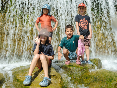
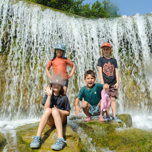
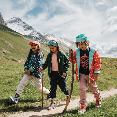
We develop clothing for little adventurers. The children are the ones who should enjoy our products. They should feel the quality and like the design. Children make decisions intuitively. While we naturally hope that the quality, innovations, and functionality of our clothing will win over the parents, children actually speak a quite different language – emotional, very honest, of strong character. In our design, our concept, they should recognize this language and feel it resonating with them. All our prints are drawn by hand, and the inspirations lie in nature. Behind every one of them is a story.

Forest
We asked children how they would envision their perfect forest. “There would be a lot of mushrooms and gigantic carrots,” one of them answered. Another wished for bridges so that animals could get around everywhere. Their answers were the inspiration for this print.

Galaxy
With this print, the artist created a galaxy of her own. Precious Things (inner lining) The inspiration for the design on the inner lining comes from the various structures and shapes of stones – the ones that are found in Swiss rivers, for example.

Twine
The inspiration for this drawing came from the mood of a rainy day.

Underground
As the name already suggests, the idea behind this print is a stylized depiction of the earth. It’s an answer to this question: What would we see if we would cut a piece out of the ground? We’d see stones, bits of wood, roots, crystals, and so much more.

Nemphis
The idea behind this print is our interpretation of the Memphis Design movement of the 1980s. It came from a collective founded in Milan of furniture, textile, and ceramic designers who all broke away from the rules of functionalism. With their individual artistic inspirations, they interpreted everyday shapes anew, playfully and with a great deal of fantasy.

Livingwall
This drawing was inspired by the element of water and the diversity of landscapes.

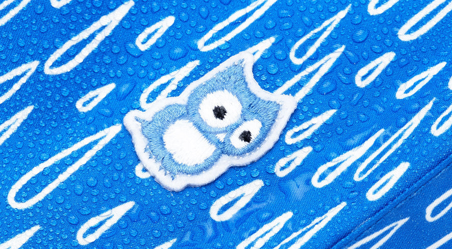
Tittles
A playful, childlike print that has been with namuk for a long time. It works with all products, colors, and shapes. While it reminds some of rain, others see the patterns of an undiscovered animal species, or maybe lots of little owl beaks. What do you see?

Legna
This print was launched, brand new, with our spring collection 2024. It’s an interpretation of the structure of pine wood.

Legna Polka
“The story we imagined: the little ladybug and namuk the owl jump onto the pine wood and then straight onto the slopes,” Design Director Andreas Huber told me when I asked about the print’s origin. He explained that they wanted to continue the story of the pine wood from the Legna print.
“Another important point for us – especially with skiwear – is safety. Kids need to stand out and be easily seen on the slopes,” he said. He looked to the Polka Dot for inspiration, which first appeared in the 1920s, inspired even then by ladybugs and their symmetrical spots. “It’s a childlike yet iconic design element that adults also associate with something positive”. If you’d like to find out more about how the print came to life, you can find the full interview here.

Pets & Petsies
These little characters were created early in namuk's history and finally came to life with our first swim collection. The print has a watercolor look, which makes these hand-drawn creatures feel soft and alive. As founder Franz mentioned, the combination of a dark background and bright colors was important to ensure, as always, that kids stay visible.

Gerum
Similar to the Polka print, Gerum is a reinterpretation of a classic: the houndstooth pattern from Scotland, originally meant to look like a rooster's footprints. At namuk, this pattern gets a fresh look – hand-painted with watercolors to match the way children express themselves. While the original plays with black and white, we play with a mix of light and dark colors.

Senso
“Little owls left their footprints here,” Franz told me. He calls them “little owl steps”. If he were to make up a story for it, it would go like this: Ten little owls living in a nest in our warehouse secretly hopped out at night to explore the world. And then they accidentally pounced all over our fabrics with their tiny feet, leaving their marks.

Nest
Our latest print is our own interpretation of an owl’s nest – the owl's true home and safe retreat. The print consists of hand-drawn lines representing curved branches and twigs. It shows our world through the eyes of namuk, the little owl. This print reminds us that every big adventure should start from a safe place. Franz noted that the lines and colors are intentionally "bold" to ensure the little adventurers remain visible.

While chatting with Franz, I noticed three elements I’d never actually asked him about before. First, there’s the “Helping Hands” print on our Dea T-shirt. I wanted to know the story behind it. Franz explained: “This print is all about positivity. It’s like a smiling sun with many hands reaching out to help – in every direction, without any boundaries at all.”

Then there’s the “Rascal” print, which has been part of the namuk story for a long time. Franz mentioned that our owl has many friends around her. “In this case, it’s the little ‘rascal’ who embodies a trait we find so lovable in many children,” he told me.

And finally, there are the “Clouds” on namuk’s ski socks. According to Franz, these “little clouds” are meant to convey a very specific feeling. A feeling of being “super soft” and “fluffy” – two words that perfectly describe the character of these socks.

Right at the end, I asked the owl’s creator about his own personal favorite. Franz said: “For me, it’s Underground. It’s the one that has truly woven its way through the entire life of namuk and the journey of our owl.”
It is our wish that children are permitted to decide which colors and which look they want to wear. We don’t design for genders, and we don’t deal in classic stereotypes of gender roles. Clothing is an expression of an attitude towards life. With our products and multifaceted design, we want to empower kids, give them space for their personalities, and encourage them, when it feels right, to be different.


